 Web Development Design
Taking any concept design and implementing it to reality is a challenge in itself. All of the jobs I work on are created in a manner that follows a sequence. The initial concept starts on white board or a rough pencil sketch and it all ends up being finished on my computer and uploaded to the web. Please follow with me in the process below for the process I took to create Slice of Heaven Day Spa Website.
THE CHALLENGE
Slice of Heaven Spa was an old platform that needed to be rebuilt. My goal was to redesign the entire web application with a new look and feel but also a new user experience. I had the opportunity to start from scratch and create a new site using the same features that the old one had.
SKETCHES & LAYOUTS
Design explorations of possible on-boarding layouts were sketched. In the end, a simple design that emphasized user progress won out. The new design focused on the task at hand, provided a clear guided path for the user to follow and was vetted by engineering to be quick to implement.

CREATING A FLOW
A flow chart was created in order to help visualize the entire on-boarding process. This allowed me to identify which point users would enter the on-boarding process and how to properly guide them through it.
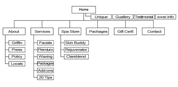
BUILDING THE STRUCTURE
Using the previous screen-caps of the old spa site as a reference. Each page was reorganized under a common menu item. The pages were condensed under a single menu item to make an easier navigate experience.
WIRE FRAME AND PROTOTYPES
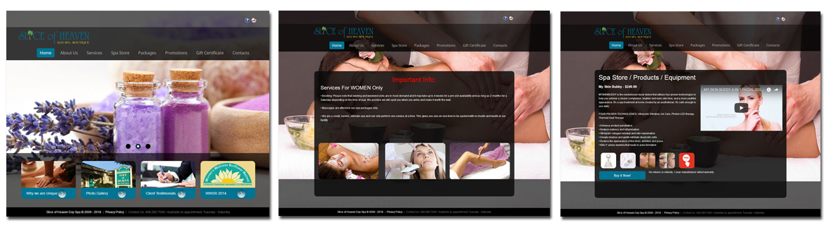
The most important aspects were ease of navigation and the ability to read and understand the information on the page. I used Adobe Photoshop and Adobe Illustrator to create the final renderings to be approved and signed off. I proceeded to write the code and lay-out the pages in Dreamweaver and making sure all the CSS was correct.
CONDENCE PAGES
All pages that were related to a specific category were restructured into tabs under that menu item. This reduced clutter on the main menu and kept the pages in context making the spa center easier to navigate. Once I was satisfied with the designs, the pages were styled using brand appropriate colors and graphics. Simplified graphics were used in place of images in order to increase legibility, reduce page load time and decrease the amount of work to update certain pages.
MOBILE FRIENDLY
The redesigned spa site was designed to be accessible no matter what device the client uses.
